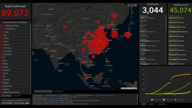
New Delhi, March 2: The coronavirus spread is increasing every passing day. Over 89,000 people worldwide have contracted coronavirus and more than 3,000 have died from it, surpassing the numbers of SARS epidemic which broke out in 2003. This pathogen, called COVID-19, belongs to the same family of viruses as Severe Acute Respiratory Syndrome (SARS). To track the spread of deadly coronavirus live on the global map, Johns Hopkins University’s Center for Systems Science and Engineering (CSSE) has launched an online dashboard.
The live dashboard, which collects data from the World Health Organization (WHO) and centres for disease control in China, Eupre and the US, gives real-time information about the all confirmed and suspected cases of COVID-19 across geographies, along with casualties. Coronavirus Outbreak: What Is the Real Size of COVID-19 Epidemic in Iran?
Click Here to View Real-Time View of the Deadly Virus
The online dashboard shows the data of successful recoveries from the virus. The interactive map is visualized through a Graphic Information System or GIS software powered by Esri.
By Monday morning, 98 positive cases including two casualties had been reported in Hong Kong, 10 cases in Macao, and 40 in Taiwan including one death. The fatal coronavirus is wreaking havoc globally, killing 54 in Iran, 34 in Italy and 22 in South Korea. The United States has also reported two deaths.
(The above story first appeared on LatestLY on Mar 03, 2020 09:36 AM IST. For more news and updates on politics, world, sports, entertainment and lifestyle, log on to our website latestly.com).


 Quickly


