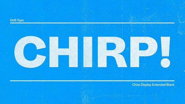
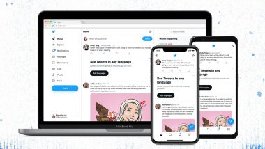
Twitter, the micro-blogging website unveiled a new design for its website on Wednesday, including a new Chirp font, tweaks to interface colours, high contrast buttons and less visual clutter. The key change is the company's new font called 'Chirp'. Previously, the company used other fonts such as Roboto, Helvetica Neue and SF Pro and now it has come up with its font. The Chirp font was unveiled in January this year and it is now ready for the users. With the new Chirp font, all Western-language text now aligns left, making it easier to read as users scroll their Twitter feed. Non-Western languages remain unchanged. Twitter Spaces Gets Co-Hosts Feature To Help Manage, Moderate Rooms.

Twitter has updated its colours too, employing high contrast and a lot less blue this time. This change will draw attention to photos and videos that users create and share.
Notice anything different?
Today, we released a few changes to the way Twitter looks on the web and on your phone. While it might feel weird at first, these updates make us more accessible, unique, and focused on you and what you’re talking about.
Let’s take a deeper look. 🧵 pic.twitter.com/vCUomsgCNA
— Twitter Design (@TwitterDesign) August 11, 2021
The micro-blogging website will also roll out new colours soon, giving its users a fresh palette. The buttons on Twitter are in high contrast too, including the 'Follow' button. This makes the most important actions taken by users stand out.
Moreover, Twitter has cleaned up a lot of visual clutter which the company refers to as unnecessary divider lines and fewer grey backgrounds. The company has also increased space to make the text easier to read. According to the micro-blogging website, this is only the start of more visual updates.
(The above story first appeared on LatestLY on Aug 12, 2021 11:08 AM IST. For more news and updates on politics, world, sports, entertainment and lifestyle, log on to our website latestly.com).


 Quickly


