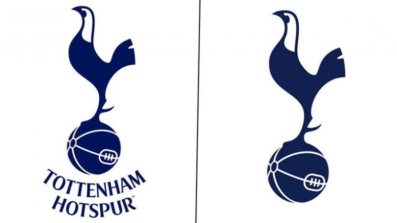
Premier League football club Tottenham Hotspur revealed their new logo as they go through a remastered brand identity. In the new logo the club have removed the curved Tottenham Hotspur text from beneath the cockerel. According to the club's statement, this enables them to increase its scale across different environments and stand proud as a true icon for the Club. The announcement of the changed logo was made through a social media where Tottenham Hotspur claimed that the changed logo will be embracing their rich history and unmistakable heritage. Arsenal Face Another Blow As Leandro Trossard Suffers Injury During Israel vs Belgium UEFA Nations League 2024–25 Match.
Tottenham Hotspur Reveal New Logo
🚨⚪️ Tottenham announce their new logo.
“We have removed the curved Tottenham Hotspur text from beneath the cockerel”.
“This enables us to increase its scale across different environments and stand proud as a true icon for the Club”. pic.twitter.com/RB13A1tpdg
— Fabrizio Romano (@FabrizioRomano) November 18, 2024
Tottenham Hotspur's Remastered Brand Identity
Introducing the Club’s remastered brand identity, embracing our rich history and unmistakable heritage.
The cockerel reimagined. An icon reborn. Our font remastered.
To Dare Is To Do. 🤍
— Tottenham Hotspur (@SpursOfficial) November 18, 2024
(SocialLY brings you all the latest breaking news, fact checks and information from social media world, including Twitter (X), Instagram and Youtube. The above post contains publicly available embedded media, directly from the user's social media account and the views appearing in the social media post do not reflect the opinions of LatestLY.)


 Quickly


