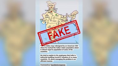
Since Coronavirus lockdown has been imposed, several fake claims are doing rounds on social media, especially on Facebook, Twitter and Instagram. In recent, a map of India is being shared widely which compares Indian states with countries based on population (UP-Brazil, Maharashtra-Mexico, Gujarat- South Africa, Rajasthan-United Kingdom, etc). The viral post claims that the map has been designed by an "American CEO" to show his employees how India is handling the novel coronavirus situation of many countries.
The post, however, does not name neither the American CEO nor the firm he purportedly leads. Bharatiya Janata Party (BJP) national general secretary Ram Madhav was also among those who tweeted the viral image. Government to Drop Money From Helicopters in Every Town and Village in India? PIB Debunks FAKE News, Reveals Truth Behind Viral Post.
"This Indian map redesigned by an American CEO where he marked the Indian states population which is almost equal to some countries. He tried to explain to his employees that India is handling #Covid19 situation of so many countries. It's about managing the problem in an efficient manner." the post reads.
Posts Going Viral on Social Media:
Interesting map pic.twitter.com/l7BdZ8BW9g
— Ram Madhav (@rammadhavbjp) April 15, 2020
This is an Indian map redesigned by an American CEO where he marked the Indian states population which is almost equal to population of some of the countries.
He tried to explain to his employees that India is indirectly handling COVID-19 situation of so many countries. pic.twitter.com/UrTAHFgXXX
— Satyakam Sharma (@satyakamsharman) April 17, 2020
This indian map redesigned by an American CEO (?), by marking Indian states population which is almost equal to some countries in the world.
He tried to explain to his employees that India is handling #Covid19 situation equal to 23 countries altogether.
I bow to Modiji 🙏
— NRC & UCC Next 🇮🇳 Jai Shri Ram🚩 (@pardhu_leo) April 15, 2020
The LatestLY Fact Check team found that the post has nothing to do with the novel coronavirus situation as the image is eight years old. The picture was first shared by Arpan Srivastava on Quora in 2012. In the post had explained that India has "more than double the number of people as the European Union! Some of our states are more populous than major G-20 countries." Here's the LINK of his Quora post.
The same image was also widely shared in 2016 when people compared Indian states with countries of equivalent population.
Thought provoking map! --> "Indian states mapped to countries of equivalent population" #map #population pic.twitter.com/NDzMXA0Rj9
— Amit Ranjan (@amitranjan) April 13, 2016
India population now at 1250 mill.
Look at this map - India is not just another country - it's enormous! pic.twitter.com/IKn4Q4BY10
— Erik Solheim (@ErikSolheim) April 29, 2016
Therefore, it is clear that the map has nothing to do with COVID-9 situation. It is shared falsely with distorted information.
Fact check

An American CEO draws a redesigned map of India to show his employees how India is handling the novel coronavirus situation of many countries.
The post has nothing to do with the novel coronavirus situation as the image is eight years old. The picture first appeared in Quora in 2012. Hence it is fake.
(The above story first appeared on LatestLY on Apr 17, 2020 04:43 PM IST. For more news and updates on politics, world, sports, entertainment and lifestyle, log on to our website latestly.com).


 Quickly


